
What is a dashboard?
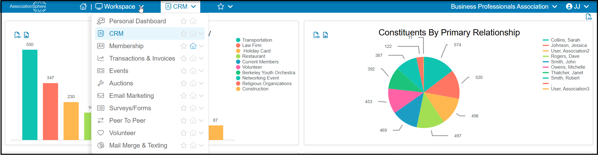
When you log into AssociationSphere for the first time, you will see the CRM Module Dashboard. Each of the modules listed under the workspace menu has a dashboard which provides a summary of metrics for that module. The dashboards are built in to the software and are not editable, however some of the graphics have dropdown menus to allow you to select specific information to display.
Each dashboard is viewable by clicking on the name of the module under the main workspace menu.
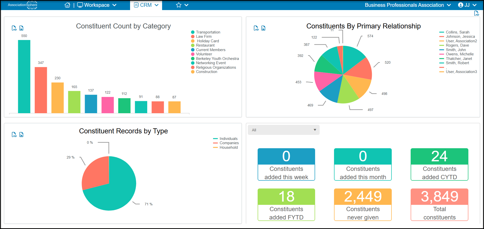
The CRM Module Dashboard gives you an overview of the constituent records including:
- Constituent Count by Category - the top left quadrant displays the top 10 constituent categories. Clicking on any of the bars will open the Constituents grid with a special view to list all the constituents in that category.
- Cumulative Received Amount - the top right quadrant displays a list of top donors. There are two dropdowns to customize the data displayed. The left dropdown allows you to choose from various date ranges and count types. The right dropdown allows you to choose how many constituents are displayed on the graph.
- Constituent Records by Type - the bottom left quadrant displays a pie chart for the Constituent Records by Type with the percentage of the three profile types available: Individual, Company and Household.
- Constituent Counts - the bottom right quadrant displays how many constituents have been added this week, this month, this calendar year to date (CYTD) and fiscal year to date (FYTD). It will also display the total number of constituents who have never made a gift as well as the grand total number of constituents of all records types in your database. The dropdown menu allows you to filter the data by choosing specific Constituent Categories. You can click on any of the numbers in the boxes to open a special view in the Constituents grid showing just those constituents included in the count.
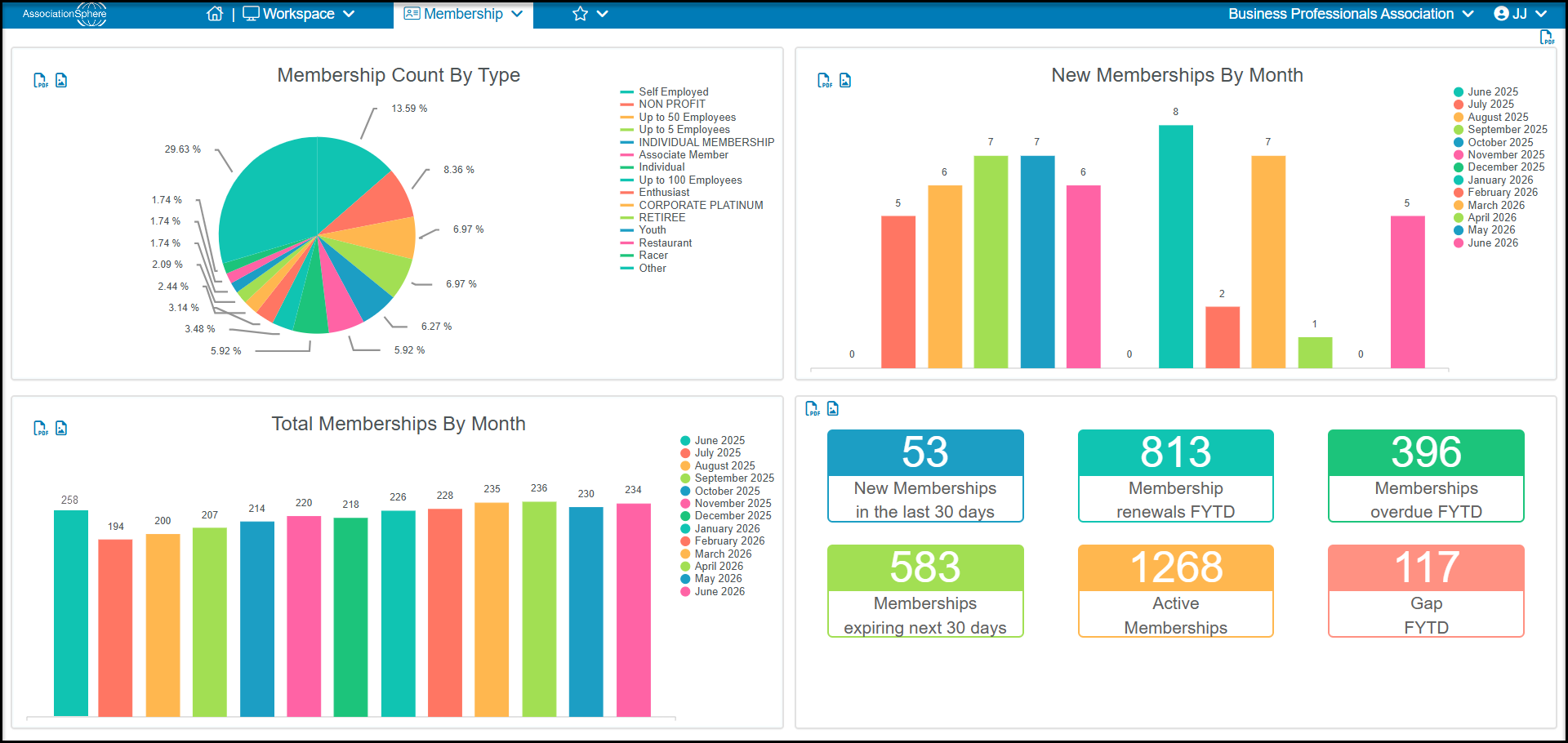
TheMembership Module Dashboard provides an overview of your membership program including:
- Membership County By Type - The top left quadrant will display a pie chart showing the percentage of memberships broken down by the membership level.
- New Memberships By Month - The upper right quadrant will show the number of new membership transactions recorded for each month in the last 12 months. You can click on a bar to open a view on the Membership grid to display the data. The Status of the transaction must be “New” to be counted in the list.
- Total Memberships by Month - The bottom left quadrant will show the total number of membership transactions each month for the last thirteen months. This will include memberships with both “New” or “Renewal” membership statuses.
- Membership Statistics - The bottom right quadrant will show summary information for memberships including how many new memberships were recorded in the last 30 days, how many membership renewals in the fiscal year, how many overdue memberships (expired) in the last fiscal year, and how many upcoming membership are expiring in the next 30 days. There is also a field showing the total number of Active memberships. This number is calculated using the Current Status field, which is only updated once per day overnight. So if new memberships were added or renewals happened after the expiration date, those transactions will not show on the dashboard until tomorrow morning. The final statistic is Gap FYTD which calculates how many memberships were renewed after their original expiration date.
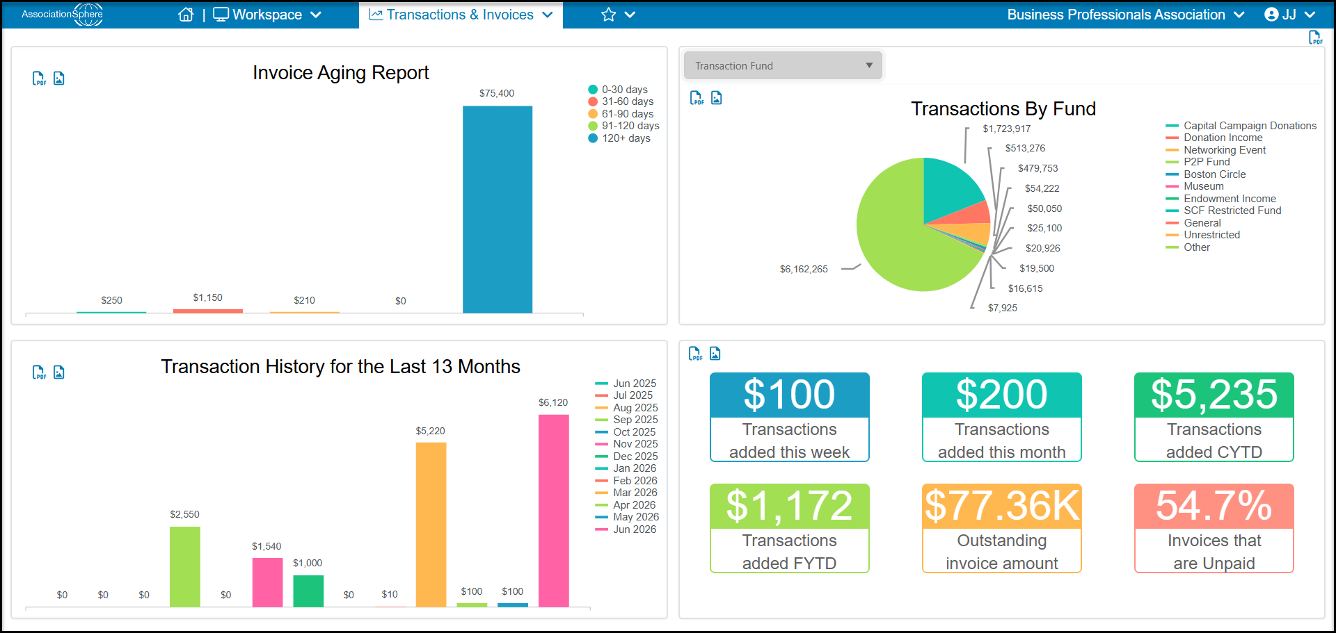
The Transactions & Invoicing Module Dashboardshows information about transactions and giving patterns including:
- Invoice Aging report- The top left quadrant will display your invoice aging report. Hovering over a bar on the graph will display the amount. Clicking on it will open a new view on the Invoices grid to display all the transactions included in the amount displayed.
- Transactions by Revenue Category - The top right quadrant will display a pie chart of Transactions By “For” by default. The dropdown menu allows you to select the revenue category to display including the For, Fund, Event, Appeal, Type or Location.
- Transaction History for the Last 13 Months - The bottom left quadrant will display the transactions received for a rolling thirteen months. You can remove a month from the display by clicking on the bar next to the month in the top right corner. To see more details, you can click on a bar in the graph to open a new view in the Gifts grid to show all the transactions included in the amount displayed.
- Summary Totals - The bottom right quadrant shows summary information for transactions recorded this week, this month, calendar year to date (CYTD) and fiscal year to date (FYTD). There is also a display of total outstanding invoice payments and percentage of invoices that are unpaid.
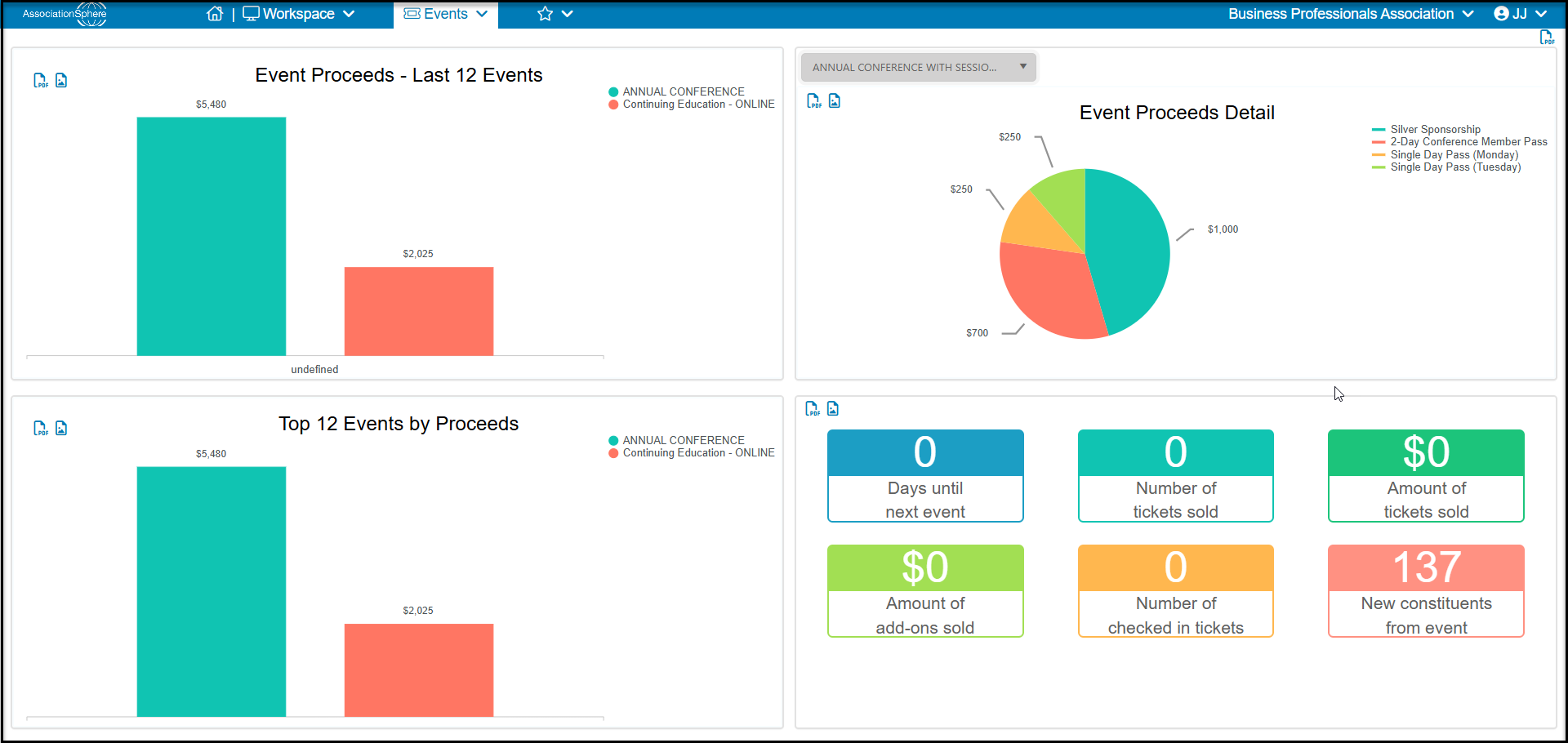
The Events Module Dashboard provides information about recent events including:
- Event Proceeds - Last 12 Events- The top left quadrant displays the revenue recorded from the last twelve events in the last twelve rolling months.
- Event Proceeds Detail- The top right quadrant will show the breakdown of tickets and add-on purchases from the most recently created event by default. You can choose which event to display by using the dropdown menu in the top left corner of the graphic.
- Top 12 Events by Proceeds- The bottom left quadrant will show the top 12 events in the last twelve rolling months. So if you have more than 12 events in the most recent 12 month period, it will only show the top 12 grossing events. If you have less than 12 events in the last 12 months, it will show all of those events in order from top on the left to lowest on the right.
- Current Event Statistics- The bottom right quadrant will display a snapshot for your next upcoming event. It will display the number of days until the event starts, the number of tickets sold and the revenue from ticket sales. It will also show revenue from Add-ons, how many attendees have been checked in for the event, as well as new constituents who were added to the database from the event.
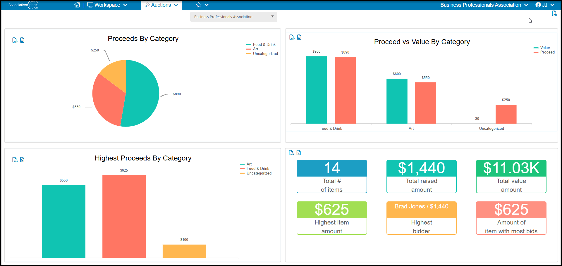
The Auctions Module Dashboard will show information for your most recent auction including:
- Proceeds By Category - The upper left quadrant will display a breakdown of proceeds raised by auction category. This will only display information for auction items that have been paid for.
- Proceeds vs Value By Category- The upper right quadrant shows the comparison of proceeds versus the designated value of the items in each category.
- Highest Proceeds By Category - The bottom left quadrant shows the highest proceeds by category - but will only show information for auction items which have been paid for.
- Auction Statistics - The bottom right quadrant will show the total number of items, total raised, total value assigned to all auction items, the highest amount received for a single item, who the high bidder was for the item sold for the highest amount, and the sales price of the item with the most bids. Note that these numbers only reflect auction items that have been paid for.
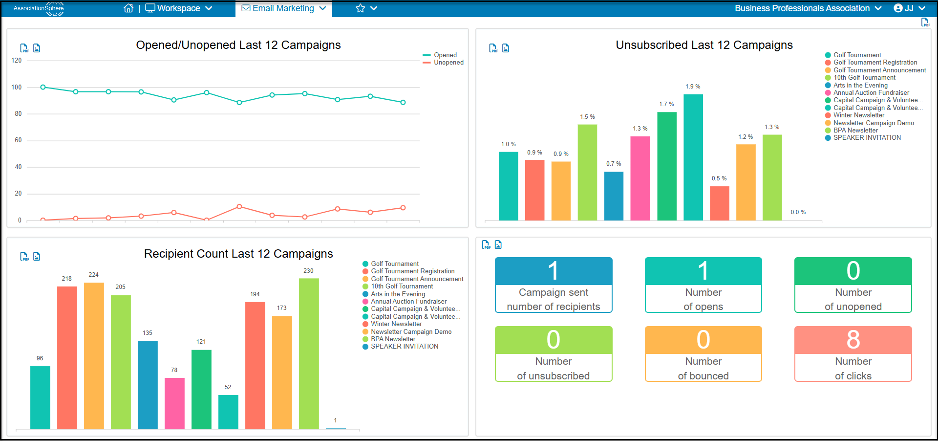
The Email Marketing Module Dashboard shows campaign comparisons and statistics including:
- Opened versus Unopened Last 12 Campaigns - The top left quadrant will compare the percentage of open versus unopened campaigns for the last 12 campaigns in the last 12 months. If you send more than 12 campaigns in a 12 month period, it will only show the last 12 campaigns sent.
- Unsubscribed Last 12 Campaigns- The upper right quadrant will show the percentage of unsubscribes received for the last 12 campaigns sent in the last 12 months.
- Recipient Count Last 12 Campaigns- The bottom left quadrant will show the number of recipients for the last 12 campaigns in the last 12 months.
- Campaign Statistics- The bottom right quadrant shows summary information for the most recent campaign sent including number of recipients, number of opens, unsubscribes, unopens, bounces, and clicks.
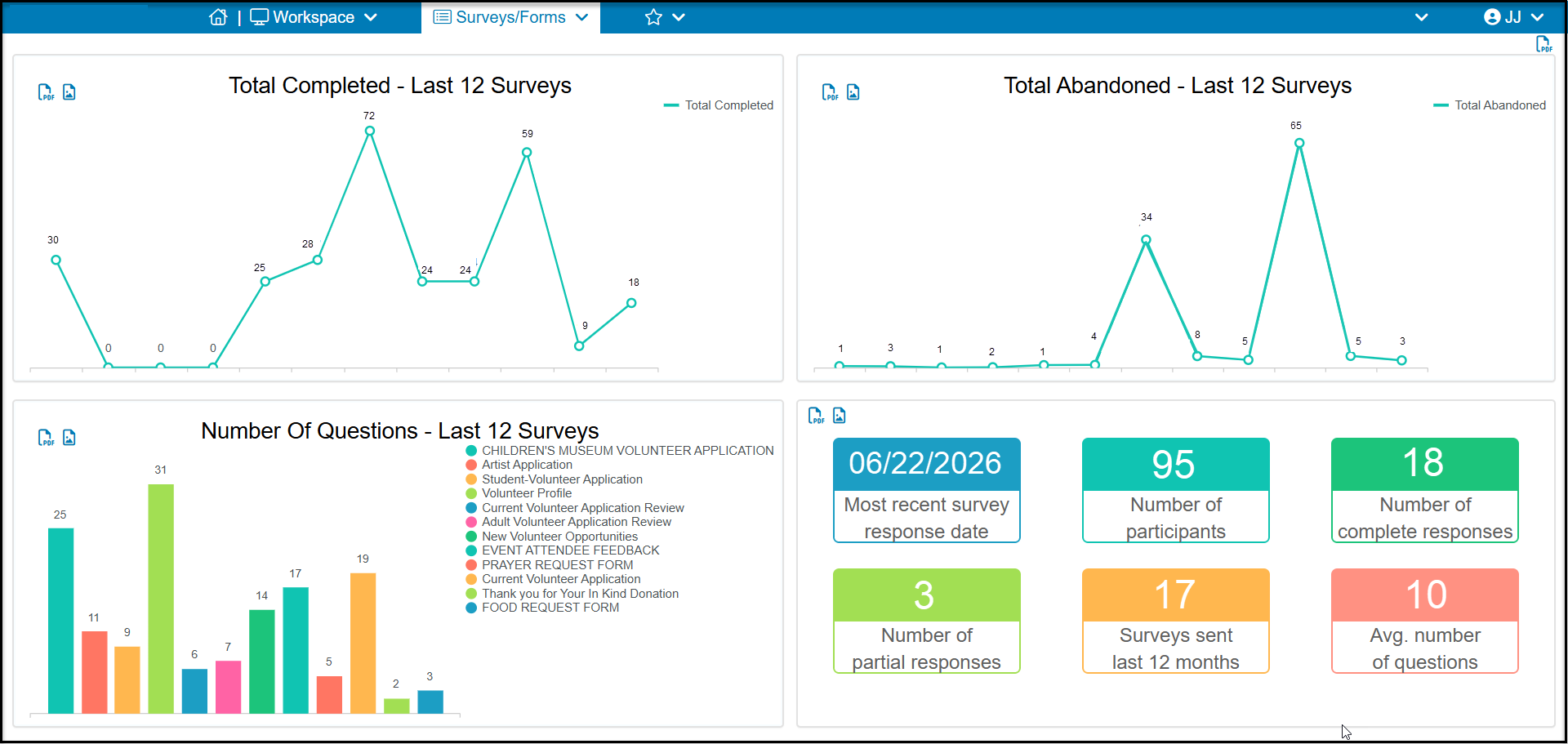
The Surveys/Forms Module Dashboard displays information on activities with surveys including:
- Total Completed - Last 12 Surveys - The upper left quadrant shows the total number of completed responses for the last twelve surveys sent created in the last 12 months.
- Total Abandoned - Last 12 Surveys- The upper right quadrant shows the number of surveys that were started, but not submitted, for the last 12 surveys created.
- Number of Questions - Last 12 Surveys- The lower left quadrant shows the total number of questions on the last 12 surveys created.
- Emailed Survey Statistics - The bottom right quadrant shows metrics for the most recently emailed survey. It will show the last date a survey response was submitted, the total number of constituents who were sent the survey, the number of complete and incomplete responses, how many surveys were emailed in the last 12 months, and what the average number of questions were asked in each of those surveys.
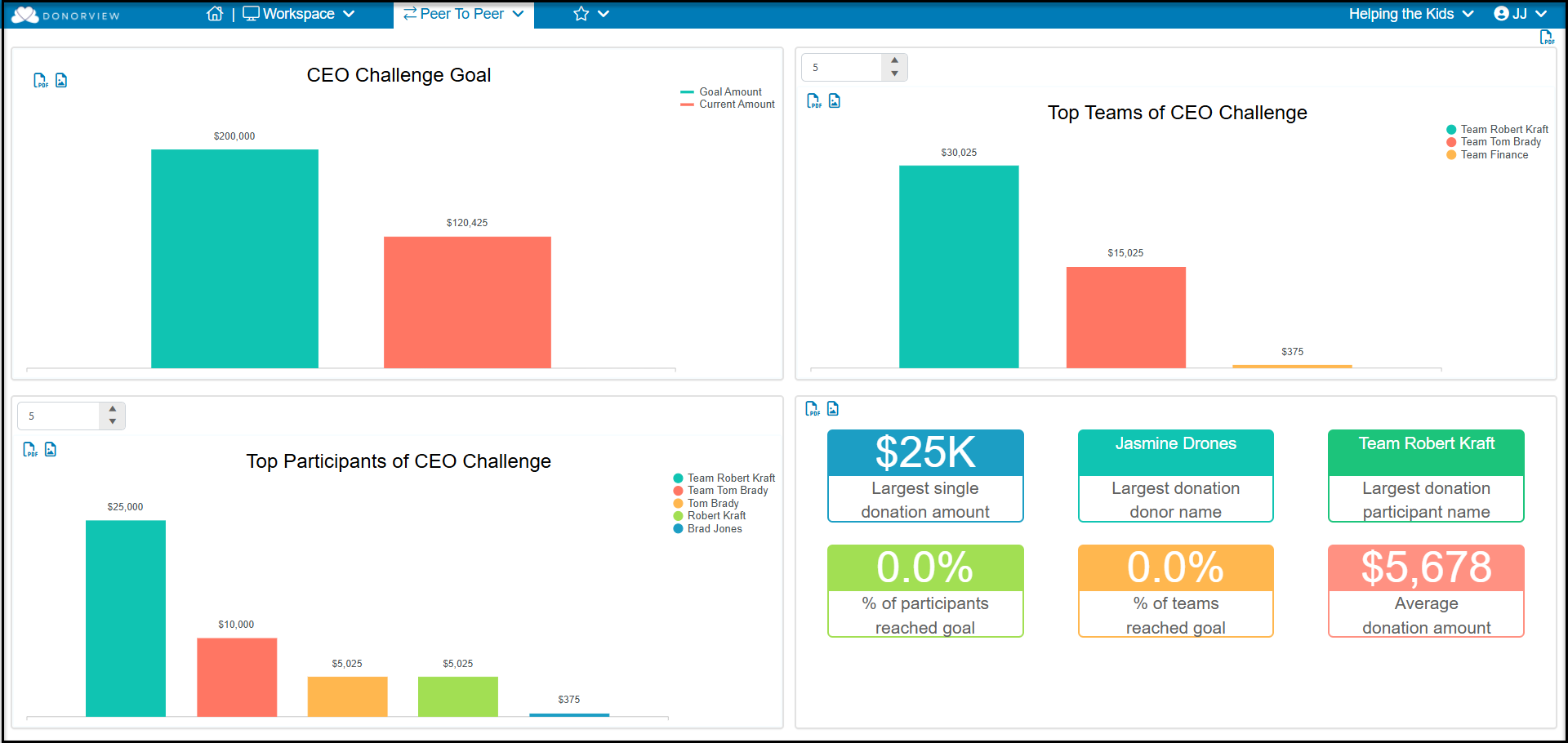
The Peer to Peer Module Dashboard will display information on your current peer to peer campaign including:
- Overall Campaign Goal- The top left quadrant will display the overall goal for your upcoming P2P campaign and compare it to the actual funds received to the campaign so far.
- Top Teams - The top right quadrant will display the top performing teams. It defaults to show 5 teams, but the dropdown menu allows you to display up to 20 teams.
- Top Participants - The bottom left quadrant will display the top individual fundraisers. By default it will show the top 5, but you can select up to 20 by using the dropdown menu in the left corner.
- P2P Campaign Statistics - The bottom right quadrant will display information for the largest single donation, the name of the largest donor, the name of the team or individual fundraiser who has the largest donation, the percentage of teams and individual fundraising participants who have reached their goal, and the average donation for the entire campaign.
Note that the main grid displaying the peer to peer campaign transactions is also labeled "P2P Dashboard" but it only displays the grid of transaction information. The module dashboard is accessed via the Workspace dropdown menu by clicking on the name "Peer to Peer."
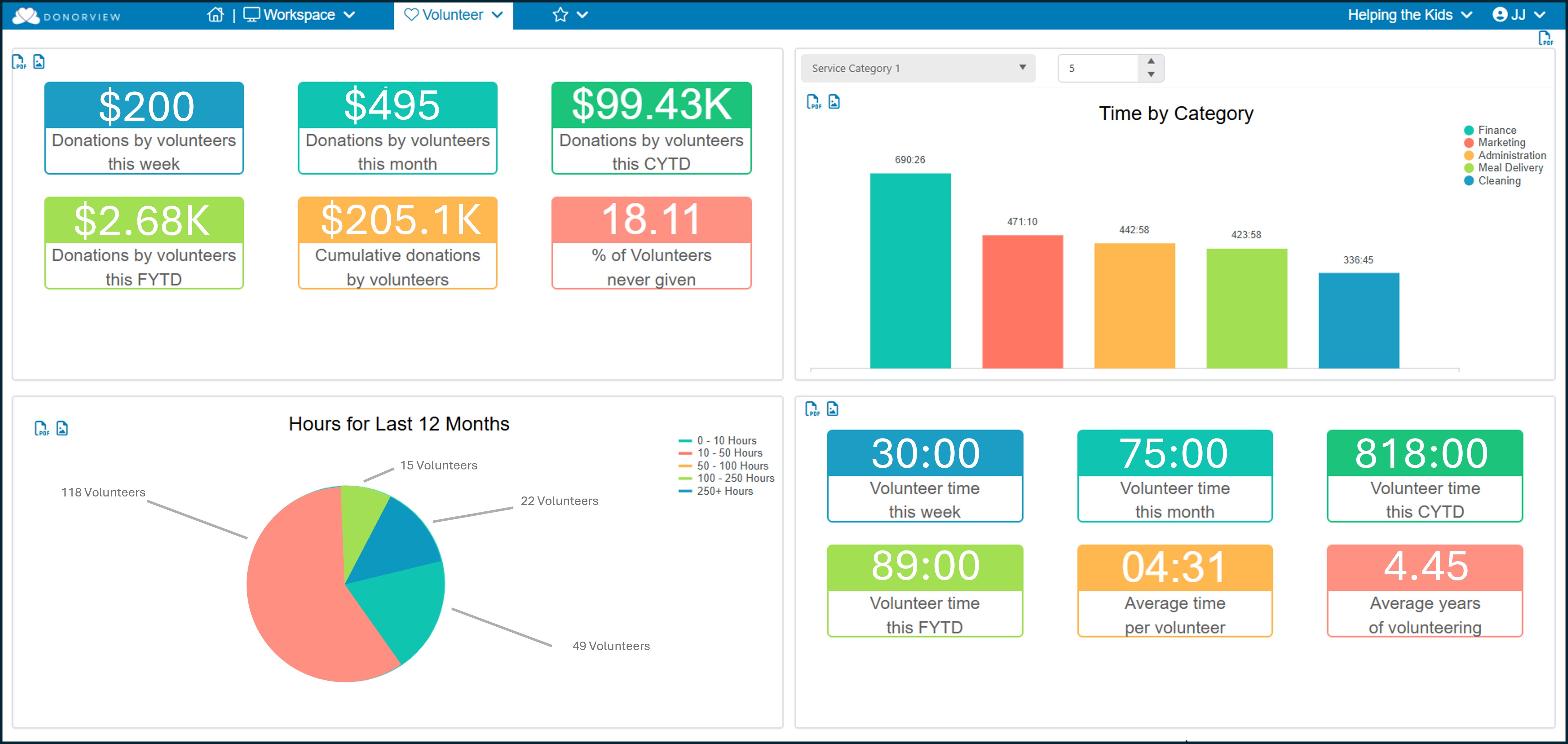
The Volunteer Module Dashboard will display information about your volunteers' time tracking and giving habits including:
- Giving History for Volunteers- The top left quadrant will display giving information for constituents identified with constituent category of “Volunteer.”
- Time by Category - The top right quadrant will display the number of hours assigned to the various Service Categories. The dropdown menus allow you to select which service categories to display as well as how many of the categories results should appear on the graph.
- Hours for Last 12 Months - The bottom left quadrant will display a pie graph representing the number of volunteers who fall into different time tracking hour ranges for the last 12 months.
- Volunteer Time Statistics- The bottom right quadrant will show summaries for the number of hours recorded for the last week, month, calendar year to date (CYTD) and fiscal year to date (FYTD). It will also display the average number of hours recorded for volunteers as well as the average number of years volunteers contribute their time.
There is no dashboard for the Mail Merge & Texting module.