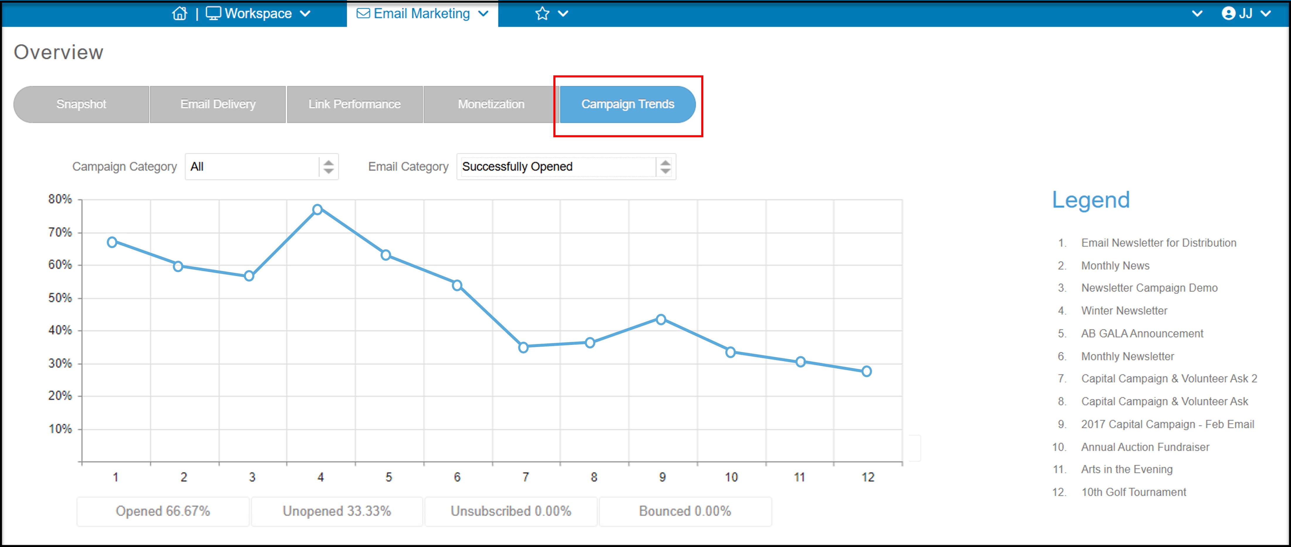
The Campaign Trends tab is where you can compare the performance of your campaigns over time. The number on the vertical axis of the graph shows the percentage opened, unopened, unsubscribed, or bounced depending on the selection you make in the drop down list next to Email Category.
You can also compare specific Campaign Categories by selecting one from the drop down on the top left of the graph.
The horizontal axis of the graph represents the campaign and the Legend on the right will explain which number the point on the axis corresponds to.
Number 1 is the most recent campaign sent. The example below shows that the open rate (percentage of emails that were successfully opened) has increased over time from just under 30% to almost 70% for the most recent campaign.
Note that this example is for visualization purposes only. The average open rate for nonprofit emails is between 24 and 30%.